之前的笔记介绍了css3-变换-渐变-动画的基本使用
这介绍几个具体的实例
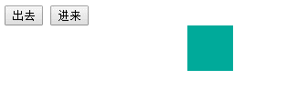
使用过渡
CSS3的transition只有在应用的元素上的属性发生变化时才会生效,所以可以把状态写在clss中,然后使用js再来改变class
<style>
    #div1{
        width: 50px;
        height: 50px;
        margin-left: 200px;
        background-color: #00aa9a;
        /*为所有属性添加过渡效果*/
        transition: all 500ms ease 0ms;
    }
    .myAnimate{
        opacity: 0;
        transform: translateX(50px)
    }
</style>

<input type="button" value="出去" onclick="aniOut()">
<input type="button" value="进来" onclick="aniIn()">
<div id="div1"></div>

<script>
function aniOut() {
    document.getElementById("div1").className="myAnimate";
}
function aniIn() {
    document.getElementById("div1").className="";
}
</script>
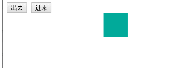
使用动画
同样也可以使用CSS3的动画来实现上述效果,好处是进入,进出动画的控制比较自由
<style>
    #div1{
        width: 50px;
        height: 50px;
        margin-left: 200px;
        background-color: #00aa9a;
        /*添加动画*/
        animation-duration: 1s;
        animation-fill-mode: both;
    }
    .myAnimateOut{
        animation-name: out;
    }
    .myAnimateIn{
        animation-name: in;
    }
    /*右侧飞出*/
    @keyframes out {
        0%{
            opacity: 1;
        }
        100% {
            opacity: 0;
            transform: translateX(50px);
        }
    }
    /*左侧飞入*/
    @keyframes in {
        0% {
            opacity: 0;
            transform: translateX(-2000px);
        }
        100% {
            opacity: 1;
            /*移动到左边很远的地方,不然会有滚动条*/
            transform: translateX(0px);
        }
    }
</style>

<input type="button" value="出去" onclick="aniOut()">
<input type="button" value="进来" onclick="aniIn()">
<div id="div1"></div>

<script>
    var div1 = document.getElementById("div1");

    function aniOut() {
        div1.className="myAnimateOut";
    }
    function aniIn() {
        div1.className="myAnimateIn";
    }
</script>
更简单的Animate.css
如果自己定义的动画帧不好看,可以使用Animate.css,里面定义好了了大量的动画,使用时只需要添加类就可以了
<script>
    var div1 = document.getElementById("div1");

    function aniOut() {
        div1.className="animated bounceOutLeft";
    }
    function aniIn() {
        div1.className="animated bounceInLeft";
    }
</script>
一些缺陷
上面虽然实现了动画效果,要么是透明度为0,要么是移动到屏幕之外看不到了,然而还会占据空间,但是有时候希望消除元素占用的空间,所以还要为元素设置display:none
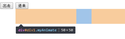
主要难点就是过渡状态结束的监听
<script>
    var div1 = document.getElementById("div1");
    function aniOut() {
        //防止乱点
        if (div1.className!="myAnimate hidden"){
            div1.className="myAnimate";
        }
    }
    function aniIn() {
        //先取消hidden再取消myAnimate,不然不会有动画
        if (div1.className==="myAnimate hidden"){
            div1.className="myAnimate";
            setTimeout("div1.className=''",10);
        }
    }
    //过渡结束的事件
    div1.addEventListener("transitionend", function () {
        if (div1.className==="myAnimate"){
            div1.className="myAnimate hidden";
        }
    }, true);
</script>
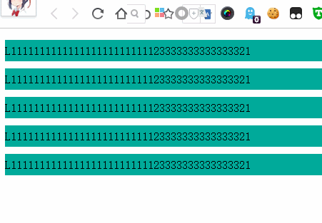
进入页面时局部动画实现
结合Animate.css,实现首次进入/刷新,加完成时,某些局部元素的动画
其实很简单,只要在元素上设置动画类就可以了,并不需要用js动态添加。相反用js动态添加可能会闪一下,再播放动画
还可以监听动画结束
<ul>
    <li class="animated bounceInLeft">L111111111111111111111111123333333333333321</li>
    <li class="animated fadeInRight">L111111111111111111111111123333333333333321</li>
    <li class="animated rotateInUpLeft">L111111111111111111111111123333333333333321</li>
    <li class="animated rollIn">L111111111111111111111111123333333333333321</li>
    <li class="animated lightSpeedIn">L111111111111111111111111123333333333333321</li>
</ul>

<!-- 并不需要 -->
<script>
    var lis = document.getElementsByTagName("li");
    for (var i=0;i<lis.length;i++){
        lis[i].addEventListener("webkitAnimationEnd", function(){
           this.className="";
        });
    }
</script>
点击冒泡动画
@keyframes fadeOutUp {
    from {
        opacity: 1;
    }

    to {
        opacity: 0;
        transform: translate3d(0, -350%, 0);
    }
}
window.onclick = function (ev) {
    var clickTips = ["富强", "民主", "文明", "和谐", "自由", "平等", "公正" ,"法治", "爱国", "敬业", "诚信", "友善"];
    var span = document.createElement('span');
    span.innerText = clickTips[parseInt(Math.random()*clickTips.length)];

    span.setAttribute("style","z-index:999;position:absolute;left:"+ev.pageX+"px;top:"+(ev.pageY-20)+"px;animation-duration:1s;" +
            "animation-fill-mode:both;animation-name:fadeOutUp;");
    document.body.appendChild(span);
    //WebKit
    if(typeof document.body.style.WebkitAnimation!="undefined"){
        span.addEventListener("webkitAnimationEnd",function () {
            document.body.removeChild(span);
        });
    }else{
        span.addEventListener("animationend",function () {
            document.body.removeChild(span);
        });
    }
}

3D翻牌效果
<div class="poker_wrap">
    <div class="poker front">
        <img src="https://game.gtimg.cn/images/kofmy/cp/a20180425xzz/card-1.png">
    </div>
    <div class="poker back">
        <img src="https://game.gtimg.cn/images/kofmy/cp/a20180425xzz/card-11.png">
    </div>
</div>
<style>
    .poker_wrap {
        margin: 0 auto;
        position: relative;
        perspective: 800px;
        perspective-origin: 50% 50%;
        width: 260px;
        height: 349px;
        font-size: 0;
    }

    .poker_wrap .poker {
        transition: all 1s ease;
        transform-style: preserve-3d;
        backface-visibility: hidden;
        position: absolute;
        top: 0;
        left: 0;
    }

    .poker_wrap .front {
        transform: rotateY(0deg);
    }

    .poker_wrap .back {
        transform: rotateY(-180deg);
    }

    .poker_wrap:hover .front {
        transform: rotateY(180deg);
    }

    .poker_wrap:hover .back {
        transform: rotateY(0deg);
    }
</style>

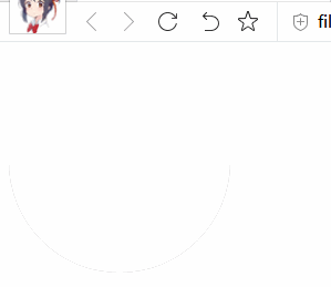
圆形加载动画
把右边框的颜射设置为透明色,实现了画出3/4圆
<div class="loading"></div>
<style>
    .loading {
        display: inline-block;
        width: 15px;
        height: 15px;
        border-radius: 50%;
        border: 2px solid #c7c7c7;
        /*画出3/4圆*/
        border-right-color: transparent;
        animation: animation-loading 1s infinite linear;
    }

    @keyframes animation-loading {
        0% {
            transform: rotate(0deg);
        }

        100% {
            transform: rotate(360deg);
        }
    }
</style>
扇形动画
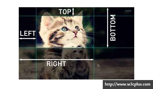
这个实现起来较为复杂,关键点在于使用这个clip属性用来绘制半圆
使用clip属性,元素必须是absolute的,rect(top right bottom left)代表矩形上边,右边,下边与左边 距离坐上角的位置
具体做法是一个灰色的半圆在上方,一个灰色的半圆在下方,上方的半圆逆时针旋转,两半圆的并集就是扇形了,但是在在转过180之后就不对了
所以还需要一个白色的半圆在上方,在180之后白色的半圆再逆时针转动,就OK了,要注意3个半圆的遮挡顺序
<div class="container">
    <div class="bottom"></div>
    <div class="top2"></div>
    <div class="top1"></div>
</div>

<style>
    .container {
        font-size: 0;
        position: relative;
    }

    .bottom {
        position: absolute;
        width: 200px;
        height: 200px;
        clip: rect(100px, 200px, 200px, 0px);
        border-radius: 100px;
        background-color: #ccc;
    }

    .top1 {
        position: absolute;
        width: 200px;
        height: 200px;
        transform: rotate(0deg);
        clip: rect(0px, 200px, 100px, 0px);
        border-radius: 50%;
        background-color: #ccc;
        animation: an1 2s linear;
        animation-fill-mode: forwards;
        z-index: 100
    }

    .top2 {
        position: absolute;
        width: 200px;
        height: 200px;
        transform: rotate(0deg);
        clip: rect(0px, 200px, 100px, 0px);
        border-radius: 50%;
        background-color: #FFF;
        animation: an2 2s linear;
        animation-fill-mode: forwards;
        z-index: 0
    }


    @keyframes an1 {
        0% {
            transform: rotate(0deg);
            z-index: 100
        }

        50% {
            transform: rotate(-180deg);
            z-index: 50
        }

        100% {
            transform: rotate(-180deg);
            z-index: 0
        }
    }

    @keyframes an2 {
        0% {
            transform: rotate(0deg);
            z-index: 0;
        }

        50% {
            z-index: 50;
            transform: rotate(0deg);
        }

        100% {
            z-index: 100;
            transform: rotate(-180deg);
        }
    }
</style>