CSS 网格布局(Grid Layout) 是 CSS 中最强大的布局系统,同时也是属性最多的。这是一个二维布局,类似于原始的 Table 布局,只不过是把 html 中的行列在 css 中定义
基础属性
通过display: grid声明一个 DOM 为 Grid 容器, 默认情况下容器都是块级元素。容器一级子元素为单元格。当然了成为单元格后,flot和display的一些属性必然会失效的
.box {
  display: grid;
  /* display: inline-grid; */
}
定义行和列
声明几个就是几行几列,如下是一个 3x3 的网格,每个格子的宽高都是 50 像素
grid-template-rows: 50px 50px 50px;
grid-template-columns: 50px 50px 50px;
当然你也可以使用百分比
height: 150px;
grid-template-rows: 33.3% 33.3% 33.3%;
为了简化输入,可以使用 repeat 函数
/* grid-template-rows: 50px 50px 50px; */
grid-template-columns: repeat(3, 50px);
/* grid-template-rows: 50px 20px 50px 20px; */
grid-template-columns: repeat(2, 50px 20px);
有时候长/宽是固定的,为了自适应屏幕你可以使用auto-fill, 他会按照固定长/宽一直摆放直到放不下
grid-template-columns: repeat(auto-fill, 100px);
有时候长/宽是不是固定的,需要按照比例划分空间,你可以使用fr单位
/* 1/4 1/4 2/4分布 */
grid-template-columns: 1fr 1fr 2fr;
/* 100px (w-100)*2/3 (w-100)*1/3 */
grid-template-columns: 100px 2fr 1fr;
/* 均分3份 */
grid-template-columns: repeat(3, 1fr);
有时候需要为了自适应,长宽在一定范围内都是可以的,让他他自适应,不至于过于宽/窄,可以使用minmax。实际上加入多列建议只使用一列,如果多列声明为 minmax 分配比例会不好计算
/* 第三个溢出 */
width: 300px;
grid-template-columns: repeat(3, 120px);
/* 第三个自适应为60px */
width: 300px;
grid-template-columns: 120px 120px minmax(1px, 120px);
如果需要直接分配剩余空间,可以使用auto
grid-template-columns: 120px 120px auto;
/* 其实minmax也可以做到 */
grid-template-columns: 120px 120px minmax(0px, 1fr);
单元格的间距
使用grid-row-gap属性设置单元格行间距,使用grid-column-gap属性设置单元格行间距,最新标准里 grid-前缀已被删除
grid-row-gap: 20px;
grid-column-gap: 20px;
/* 简写方式 */
grid-gap: 20px 30px;
单元格定位
网格布局中最关键的是声明网格的位置了,确定位置的就是声明单元格从哪行开始哪行结束,哪列开始哪列结束。默认情况下都是左到右从上到下,占据一行一列进行顺序摆放
注意:这里的起始网格线上到下、左到右都是从 1 开始的
grid-column-start: 1;
grid-column-end: 3;
grid-row-start: 1;
grid-row-end: 3;
/*等价,开始/终点 */
grid-column: 1 / 3;
grid-row: 1 / 3;
/* 等价,开始/span 跨多少 */
grid-column: 1 / span 2;
grid-row: 1 / span 2;
/* 等价 */
grid-area: 1 / 3 / 3 / 3;
网格线和网格取别名
为了方便单元格的定位,可以在定义行和列时对网格线取别名。如下两列一共有三条网格线,每条线也可以取多个别名。
.box {
  display: grid;
  grid-template-columns: [line-1 l1] 100px [l2] 100px [l3] 100px;
  grid-template-rows: [r1] 100px [r2] 100px [r3] 100px;
}
.box > div:nth-child(1) {
  grid-row-start: r1;
  grid-row-end: r3;
  grid-column-start: l1;
  grid-column-end: l2;
}
同样的网格也可以起别名用grid-area进行辅助定位,如果某些需要忽略可以设置为.
.box {
  display: grid;
  grid-template-columns: 100px 100px 100px;
  grid-template-rows: 100px 100px 100px;
  grid-template-areas:
    'a b c'
    'd e f'
    'g h i';
}
.box > div:nth-child(1) {
  grid-area: e;
}
网格摆放策略
使用单元格定位后,单元格可以设置跨几行几列,如果多个 div 占据同一个空间会怎样呢,系统会优先保证 css 的正确性,比如同时设置的跨列没有设置跨行,如果在一行内有重叠,系统肯定为把后面的放到下一行,同时保证跨行的设置正确。如果都定义了行和列,且有重合,实际就会重合。对于其他元素,系统会参考它的前一个元素进行默认摆放。
.box {
  display: grid;
  grid-template-columns: repeat(3, 100px);
  grid-template-rows: repeat(3, 100px);
  grid-auto-flow: row;
}
.box > div:nth-child(1) {
  grid-column-start: 1;
  grid-column-end: 3;
}
.box > div:nth-child(2) {
  grid-column-start: 1;
  grid-column-end: 3;
}
显示效果如下,1,2 同时定义了跨列规则,为了保证属性正确,系统让 2 换行。同时如果容器声明了grid-auto-flow: row dense那么其他元素元素的摆放策略不在参照前一个,而是左到右上到下去需找剩余空间补齐
+--------------------+ +--------------------+
| +-----------+      | | +-----------+ +--+ |
| |     1     |      | | |     1     | |3 | |
| +-----------+      | | +-----------+ +--+ |
| +-----------+ +--+ | | +-----------+      |
| |     2     | |3 | | | |     2     |      |
| +-----------+ +--+ | | +-----------+      |
+--------------------+ +--------------------+
还有一种情况是单元格定义为位置不在范围内,这时候会自动生成新的行/列,这时候新生行列的宽高都是自动分配的,通过下面的属性定义
grid-auto-rows: 50px;
grid-auto-columns: 50px;
.box {
  display: grid;
  grid-template-columns: repeat(3, 100px);
  grid-template-rows: repeat(3, 100px);
  grid-auto-columns: 50px;
}
/* 摆放在容器外部,容器会自动生成单元格,新生成的宽度为50px */
.box > div:nth-child(1) {
  grid-column-start: 4;
  grid-column-end: 5;
}
单元格&容器内容位置
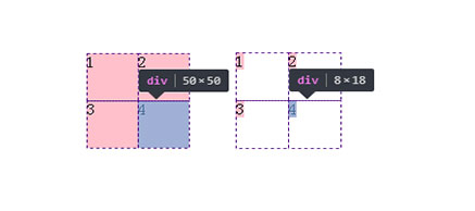
该属性作用于容器上,用于控制所有单元格内容的对齐,默认取值都是 stretch,也就是单元格内容都是宽高 100%的效果
justify-items: start | end | center | stretch;
align-items: start | end | center | stretch;
place-items: <align-items> <justify-items>;
左边:默认
右边:align-items: start;justify-items: start;
当然了也是允许单元格自己设置占据空间的
justify-self: start | end | center | stretch;
align-self: start | end | center | stretch;
place-self: <align-self> <justify-self>;
假如 div 为 400x400,单元格为 3x3,100x100,那么容器并未占满 div,通过该属性可以控制容器内容(单元格)的位置,基本的作用和 flex 布局的那些属性相似
justify-content: start | end | center | stretch | space-around | space-between |
  space-evenly;
justify-content: start | end | center | stretch | space-around | space-between |
  space-evenly;
place-content: <justify-content> <justify-content>;
简化书写
grid-template-columns、grid-template-rows、grid-template-areas可以简写成一个grid-template属性
再加上grid-auto-rows、grid-auto-columns、grid-auto-flow这六个属性又可以简写成 grid 属性
不过不推荐简写,因为不好理解
总结
属性繁多,书写复杂,兼容性差,好处是可以解决复杂布局时候 div 嵌套的问题
但是 flex 更简单,更好用,同时自适应(毕竟叫弹性布局嘛)更好一点,我个人还是喜欢用 flex 的,一般就够了